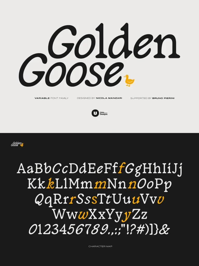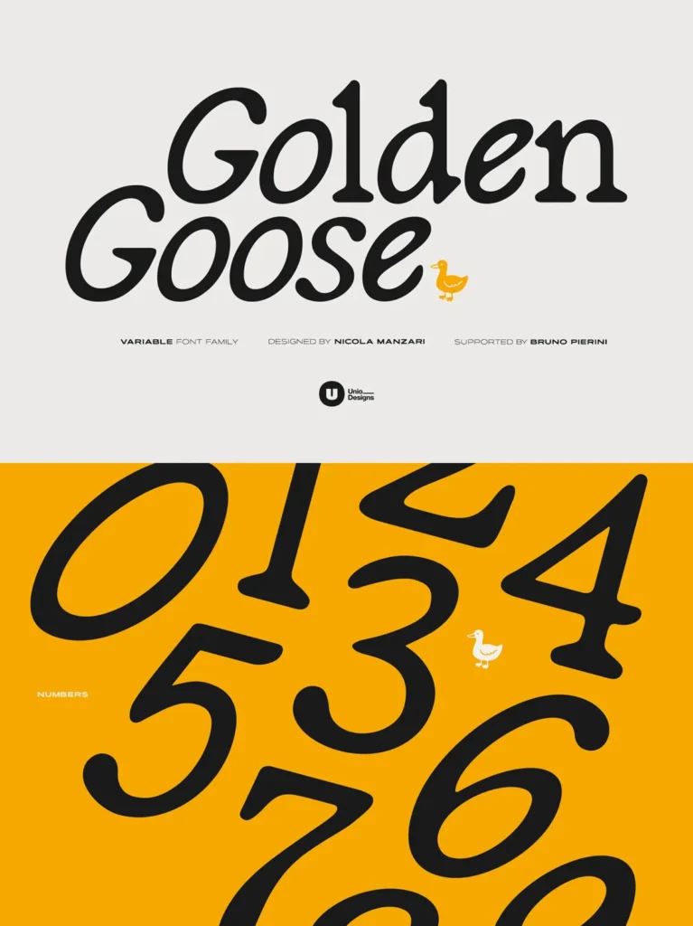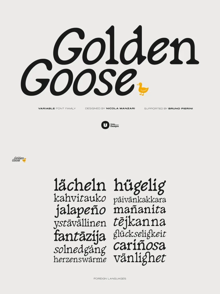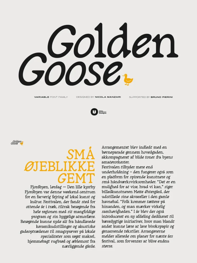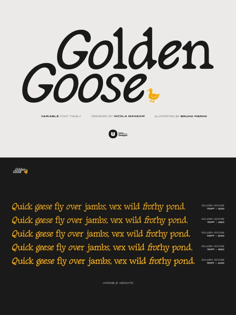
Golden Goose — Serif With a Natural Slant
Golden Goose takes a distinctive approach to serif typography by building italic character into the regular style. A calibrated slant runs through the round letters, giving the face an organic flow while keeping its serif structure clear and dependable. The result feels warm and human, yet remains controlled enough for professional typography.
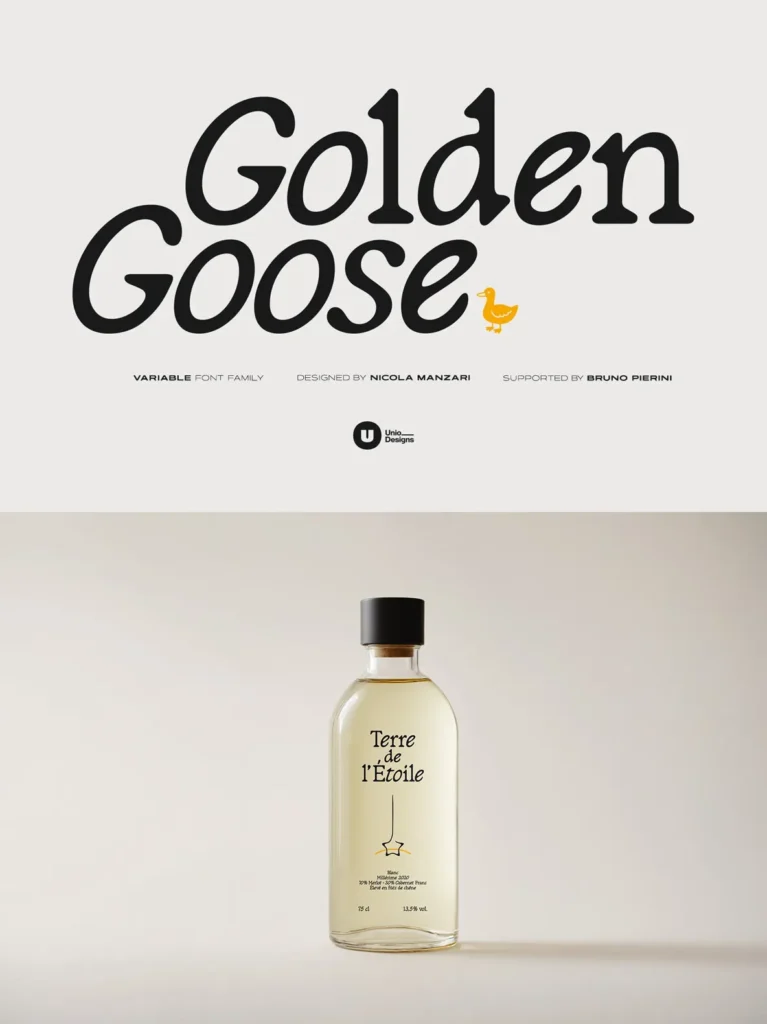
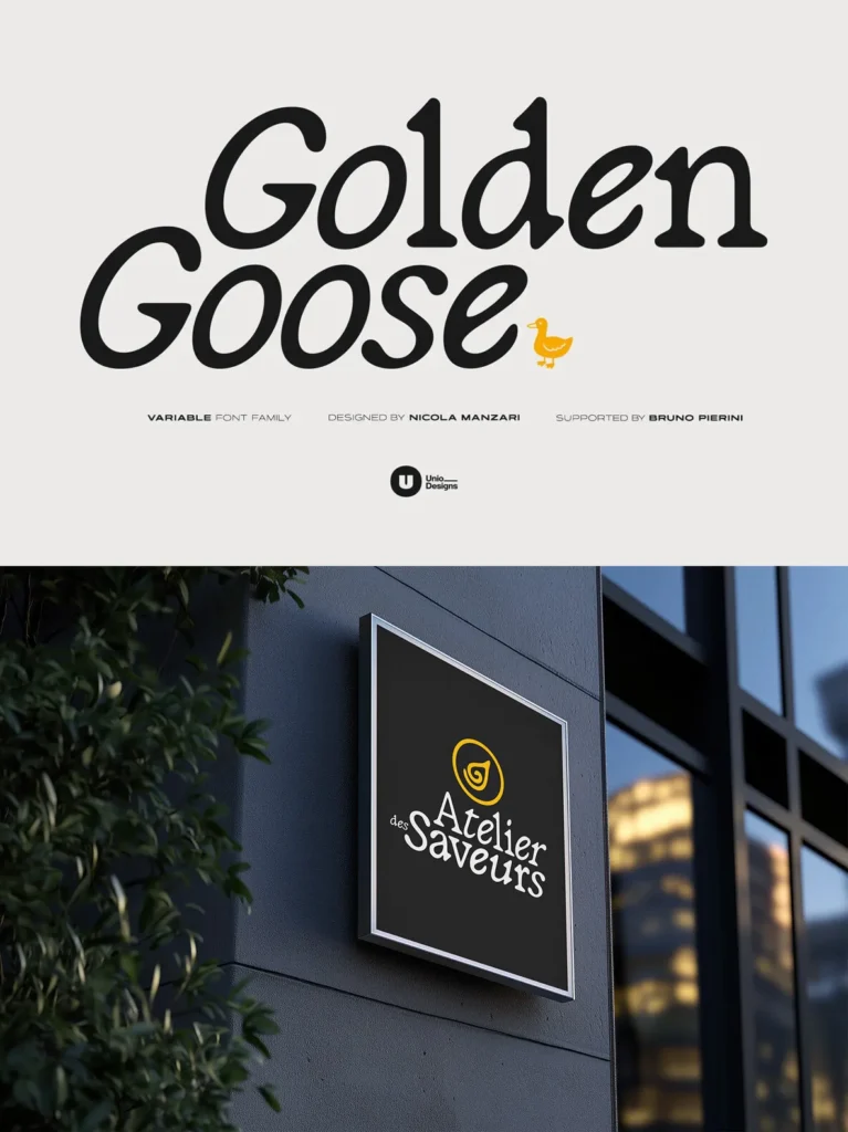
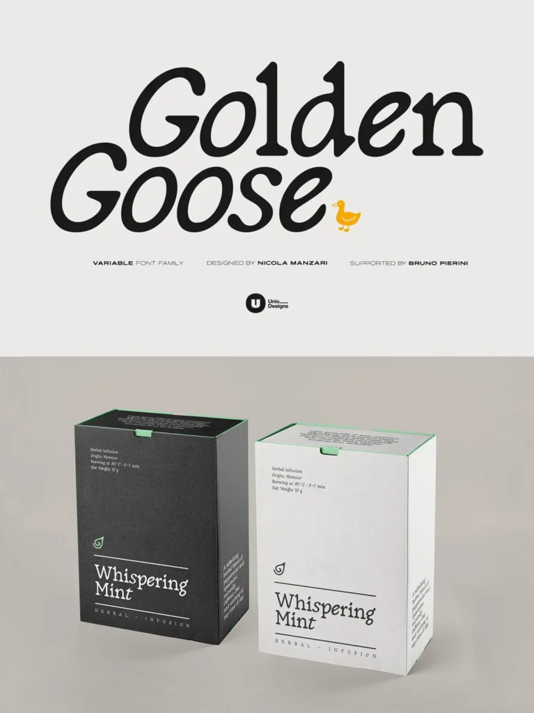
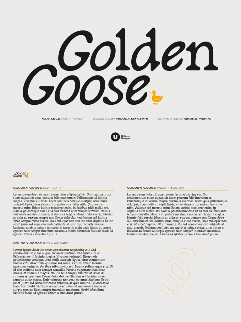
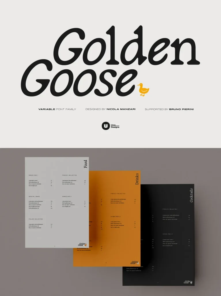
Drawn with meticulous attention to detail, Golden Goose pairs handmade curves with a solid serif foundation. The variable build includes two essential weights and moves smoothly from a light, airy tone to a more solid, authoritative presence. Use it across branding, editorial design, packaging, and print identities when you want craft, clarity, and personality in the same serif typeface.
Features
Italic Traits
– Fused into round forms for an authentic expression.
Variable Font
– Includes Light and Regular weights.
Enhanced Features
– Includes ligatures, alternates, numerals, and symbols.
Optimized Spacing
– Suitable for both text and display settings.
Multilanguage Support
– Comprehensive Latin script coverage with Western and Central European diacritics.
Golden Goose fits projects that need a crafted blend of warmth and precision, without sacrificing readability. It brings a subtle motion to headlines and a calm rhythm to text, making it a reliable choice for serif typography that feels considered and quietly expressive.