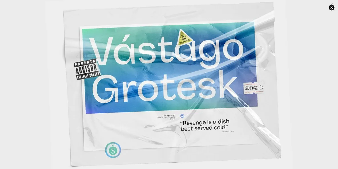
Vástago Grotesk — Ink Traps, Modern Clarity
Vástago Grotesk is a nine-weight sans serif font family inspired by traditional 20th-century grotesque designs. Its distinctive ink traps—born from the drawing of the G—set the tone for a cohesive visual universe that carries across the full system. The result is a type family with clear personality and functional distinction across multiple contexts.
Vástago Grotesk grew from an interest in exploring the possibilities of sans serif design. The process was supported by the guidance of excellent typographers worldwide through the Type Crit Crew initiative. Built with care for readability and performance, the family holds up across sizes, from a subtle Thin to a Heavy weight that projects grandeur and character. Vástago Grotesk is a challenge come true, made to be used and enjoyed.