Alecrim: Contemporary Grotesque Sans Serif With Enduring Appeal
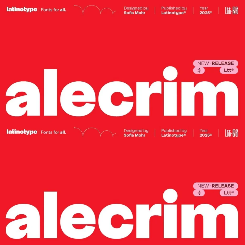
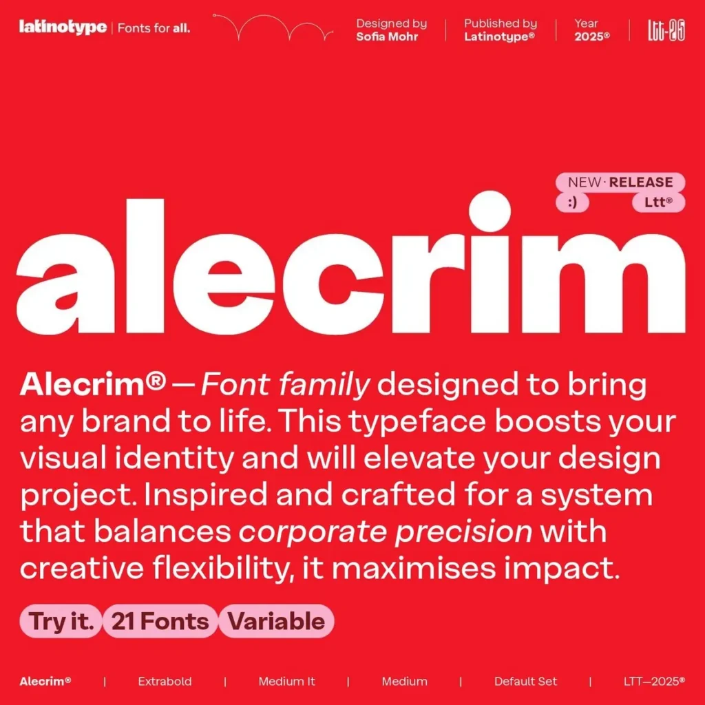
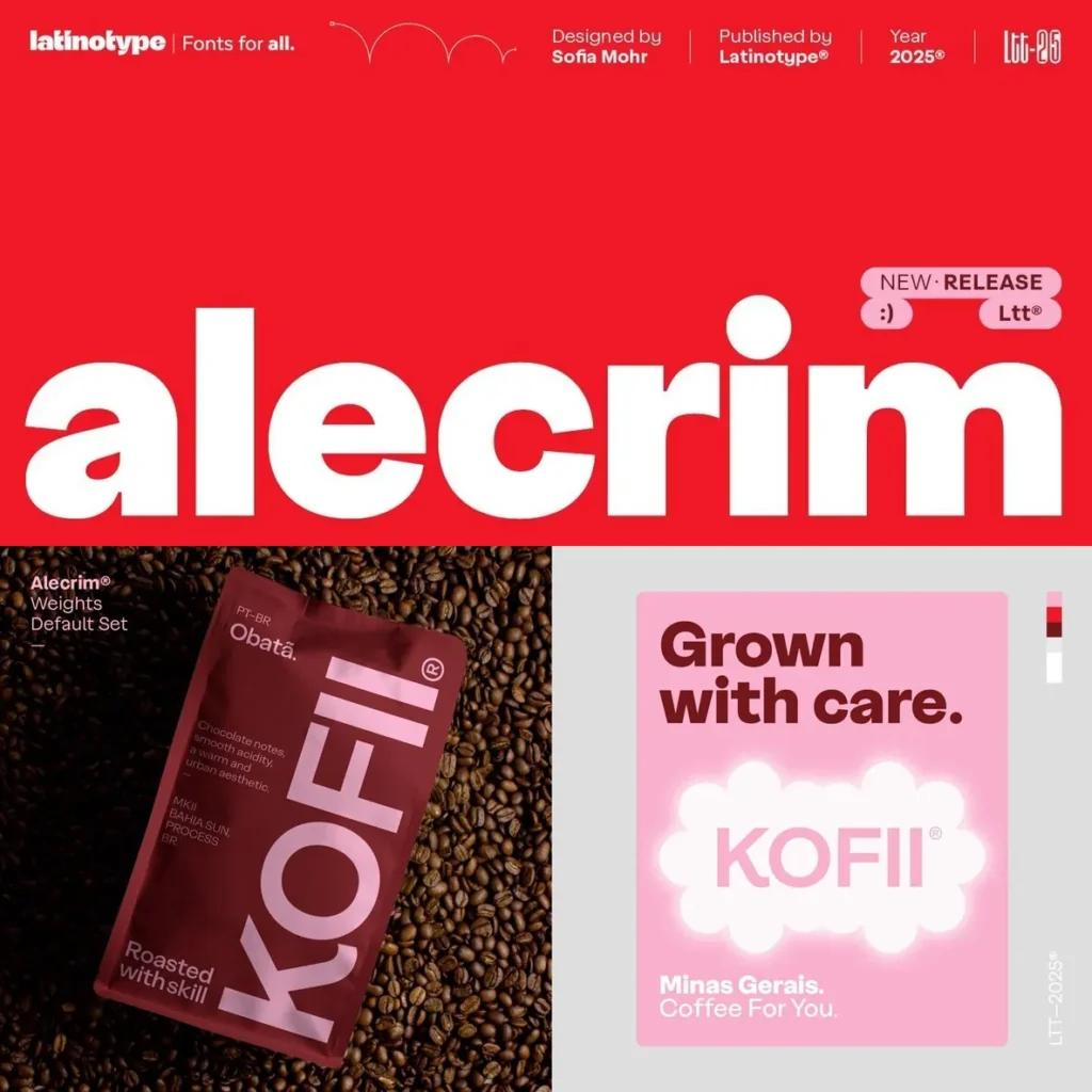
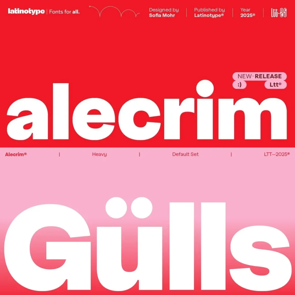
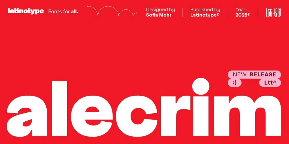
Alecrim stands as a modern grotesque sans serif defined by strong strokes, ample height, and measured construction. Designed for clarity and versatility, its balanced proportions suit both text and headlines, delivering a crisp read at small sizes and a distinct impression in larger settings. The typeface purposefully minimizes ornamentation, creating an unobtrusive rhythm that steers clear of fleeting trends or unnecessary flourishes.
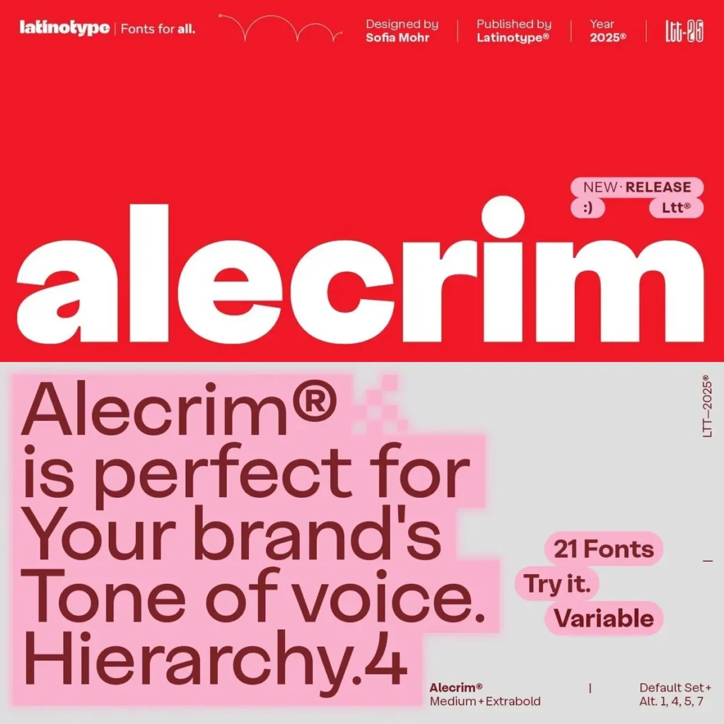
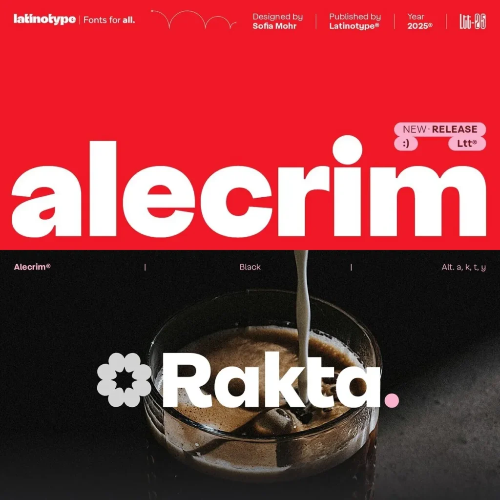
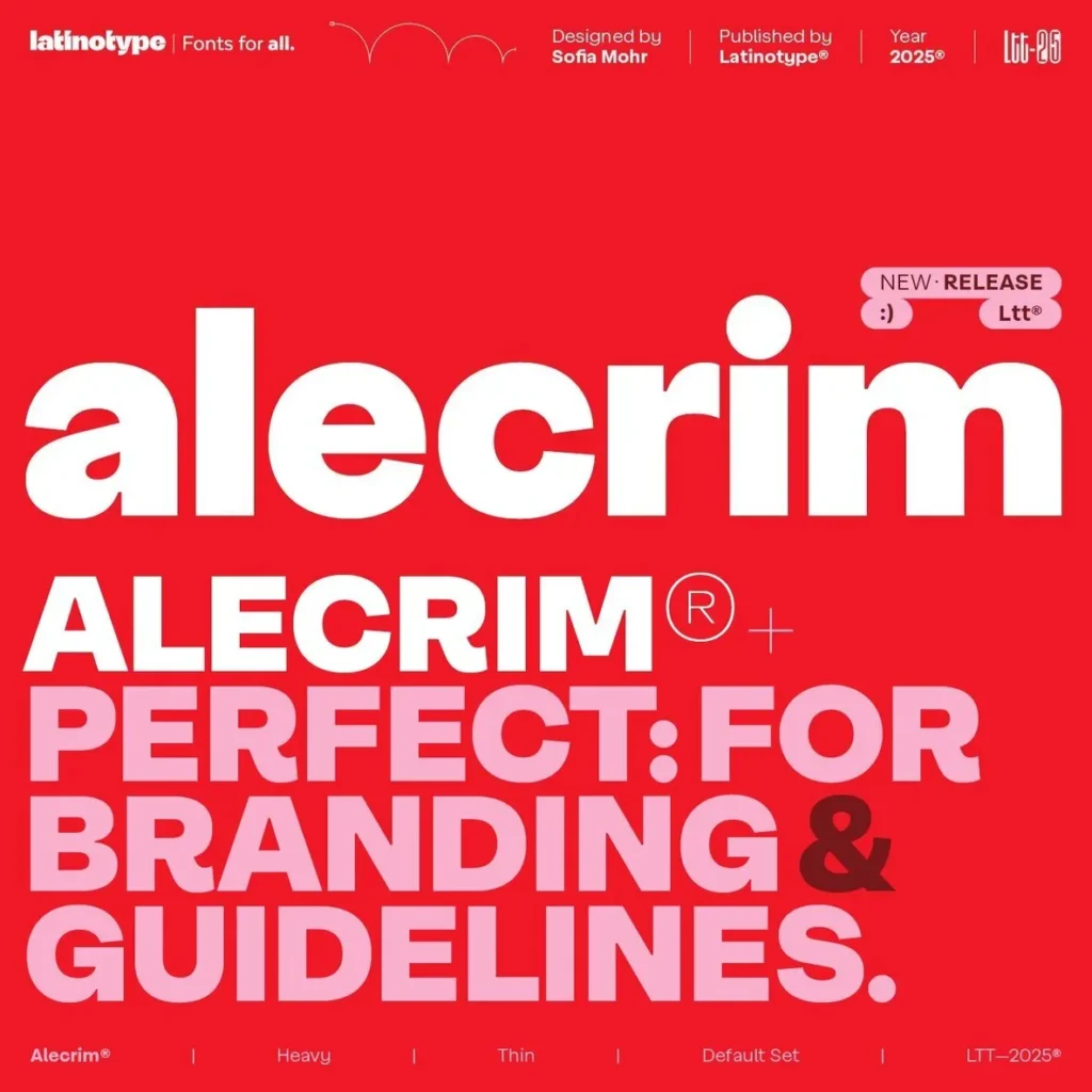
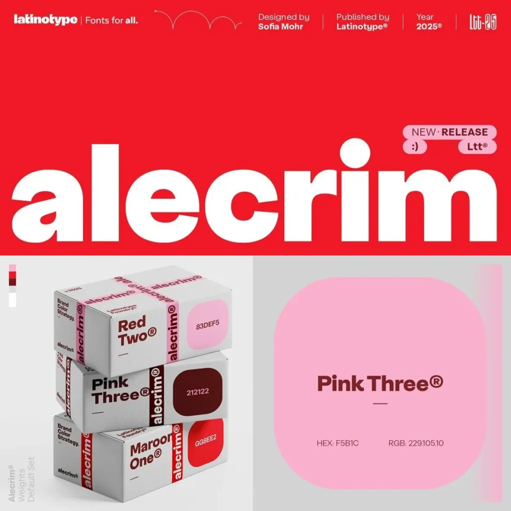
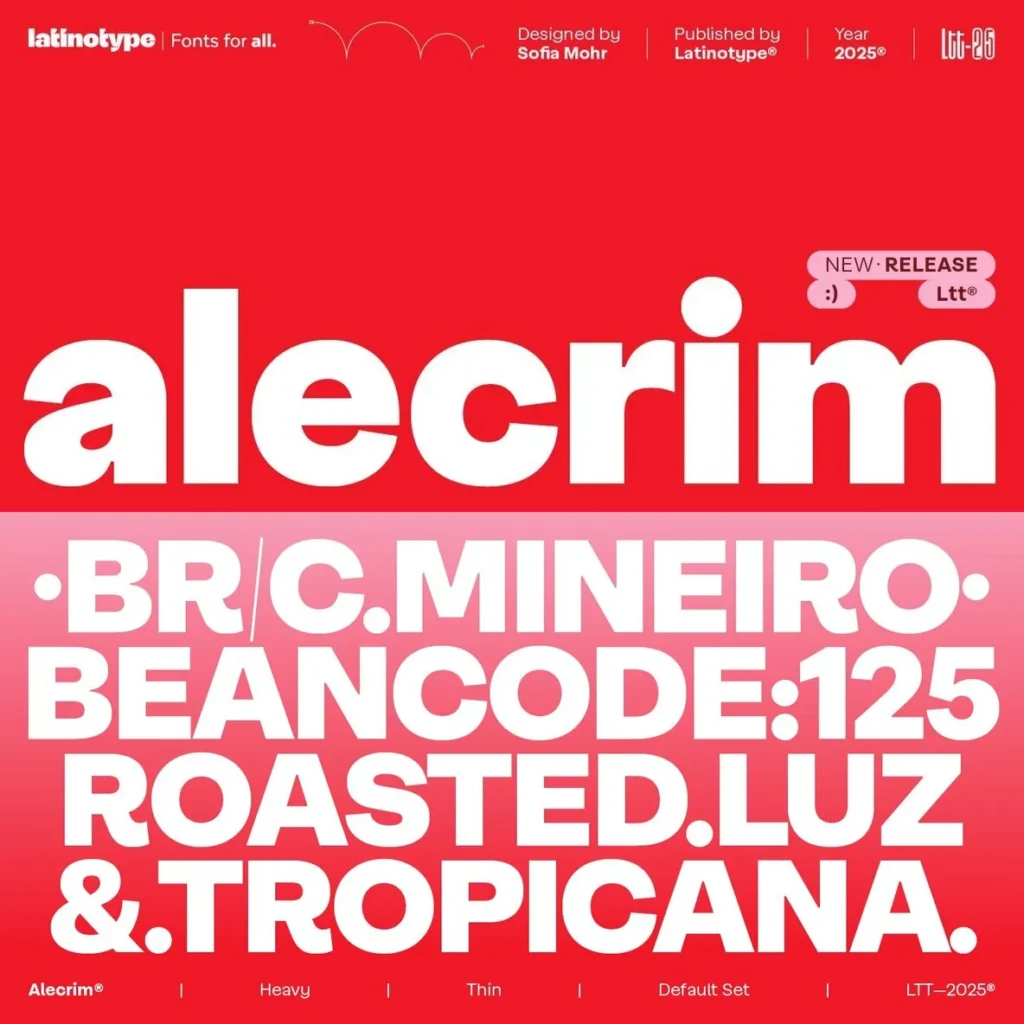
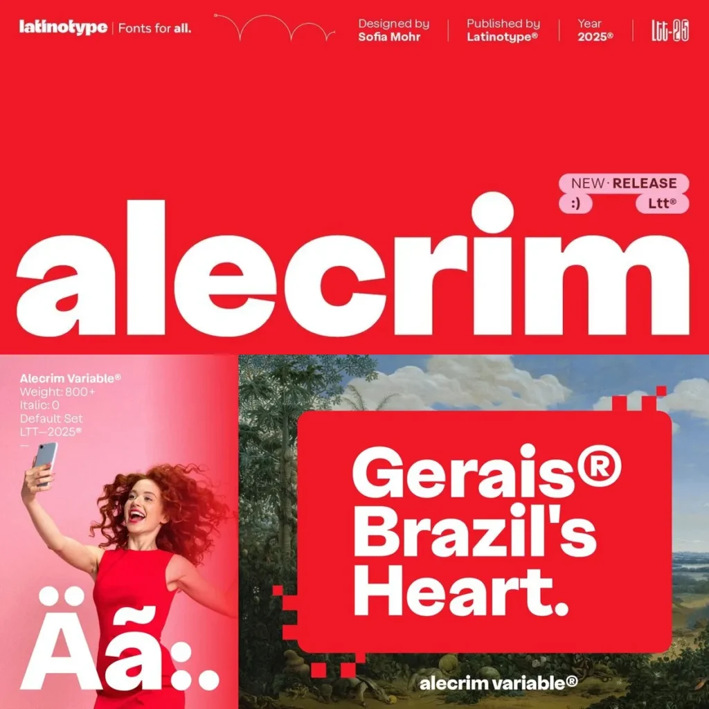
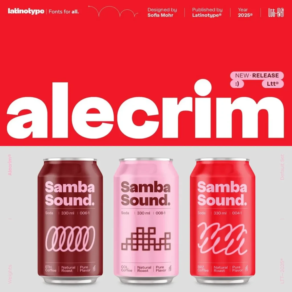
With ten distinct weights—ranging from Ultra Thin to Black—and matching italics, Alecrim offers a total of twenty styles, all available as a variable font. Text weights prioritize legibility, supporting extended reading, while display alternates imbue expressive qualities. Features such as taut curves, closed terminals, and low contrast infuse each line of text with a subtle character and a steady visual rhythm.
Influenced by iconic 20th-century grotesques, Alecrim shares a visual lineage with Helvetica, Frutiger, and Franklin Gothic. Its precise geometry and structural integrity make it well suited for visual identity, editorial layouts, and systems requiring consistent clarity and neutrality. Alecrim’s contemporary voice meets the demands of projects seeking durability and polished simplicity.
Features:
Ten weights from Ultra Thin to Black
Matching italics for each weight
Variable font for dynamic style adjustments
Alternate sets for enhanced display expression
Taut curves, closed terminals, and low contrast
Optimized for readability and versatility