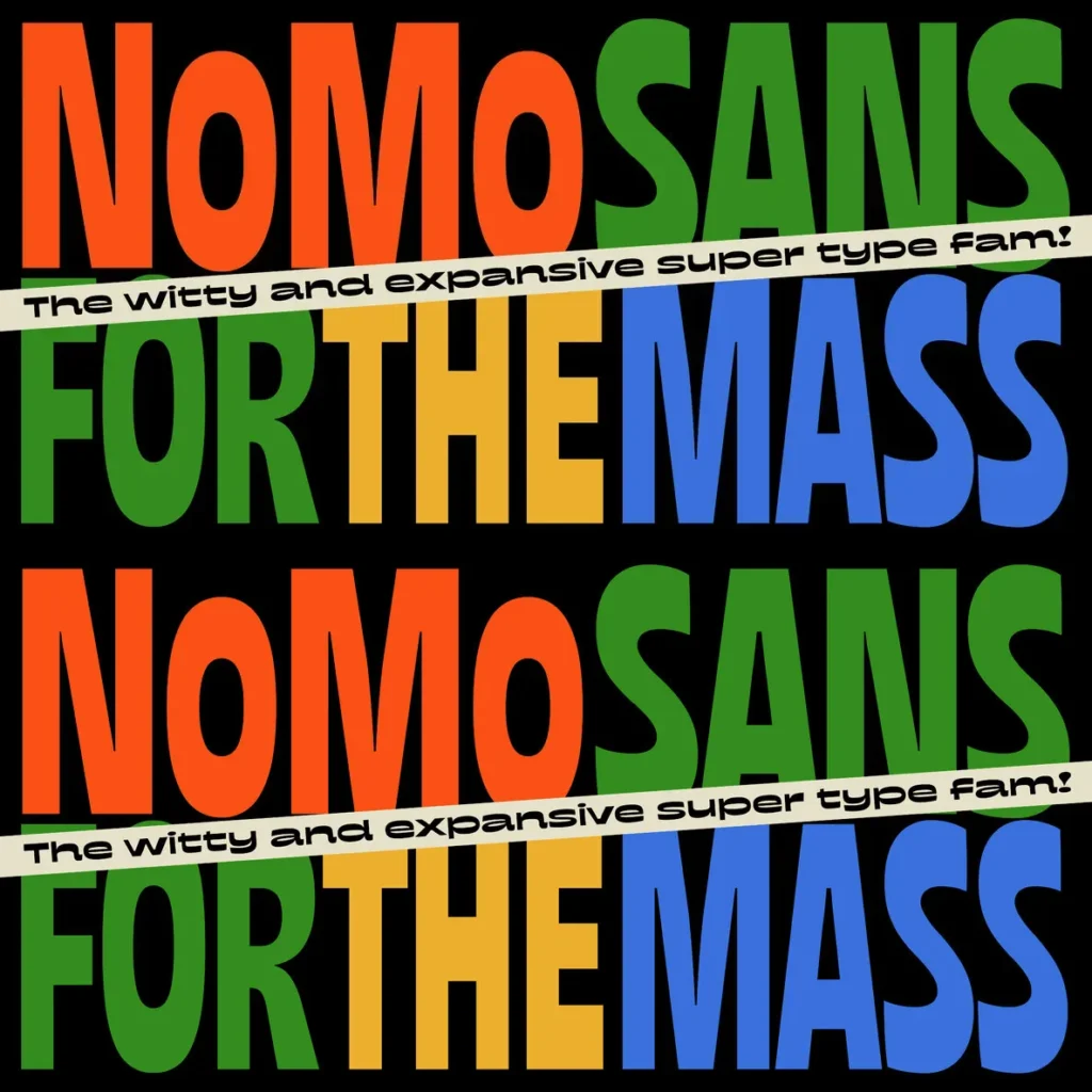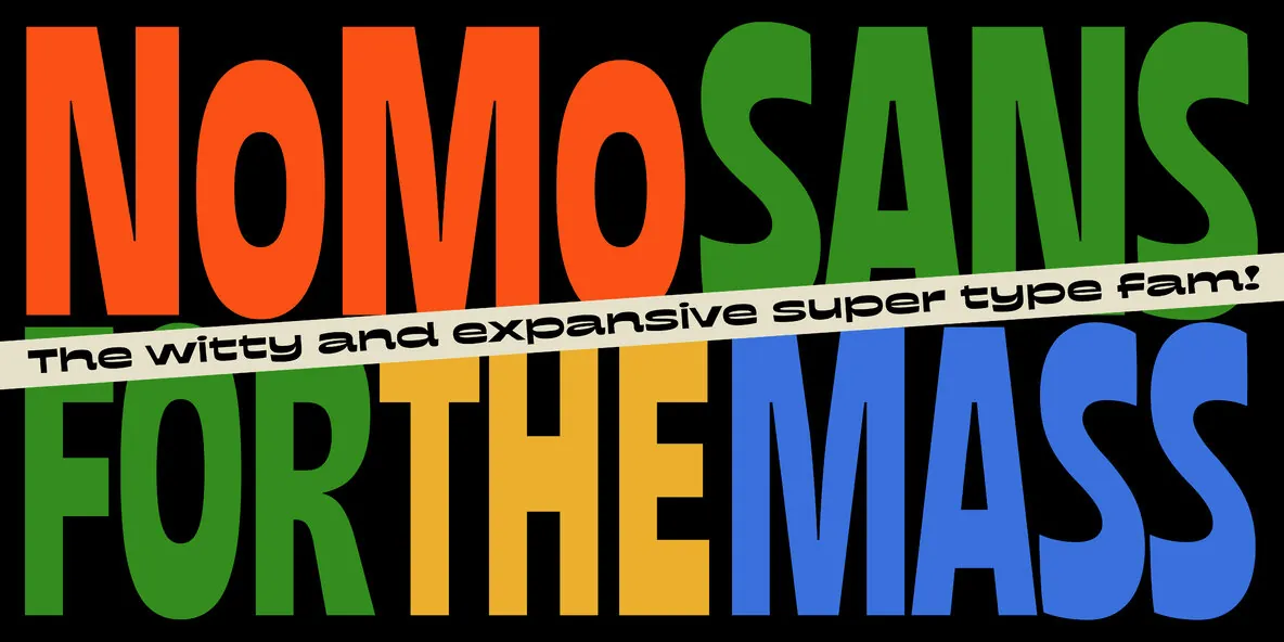
wNoMo Sans — A Groovy System with Attitude
NoMo Sans arrives with a witty, expansive voice and a clear taste for the irreverent. It began years ago as an exploration of the mischievous, the improvised, and the unexpected. Even then, its playful personality was obvious—full of attitude and happy to break the mould. At first, it stayed in a simple range: a touch condensed here, a little expanded there. Later came the remix. The question was straightforward: what if it could swing harder? The answer was to add extreme masters and push the system into suuuuper wide—and even more suuuuper condensed—territory. That required rebuilding the entire system, and it proved complex, but worth it. NoMo Sans is a one-axis variable type family with a strong but enjoyable inverted contrast.
Expect a type system built on soft curves and smooth terminals, then punctuated by quirky shapes that step out of line and improvise. Its groovy letterforms bring rhythm and musicality, giving text a wordmark-like presence, while wide language support lets you set it in almost any Latin speech. From Ultra Expanded to Ultra Condensed (a 1:22 ratio), it covers serious typographic ground for deep layout solos or tight ensembles. Whether you keep it restrained or go full big band, NoMo Sans stays ready to swing.