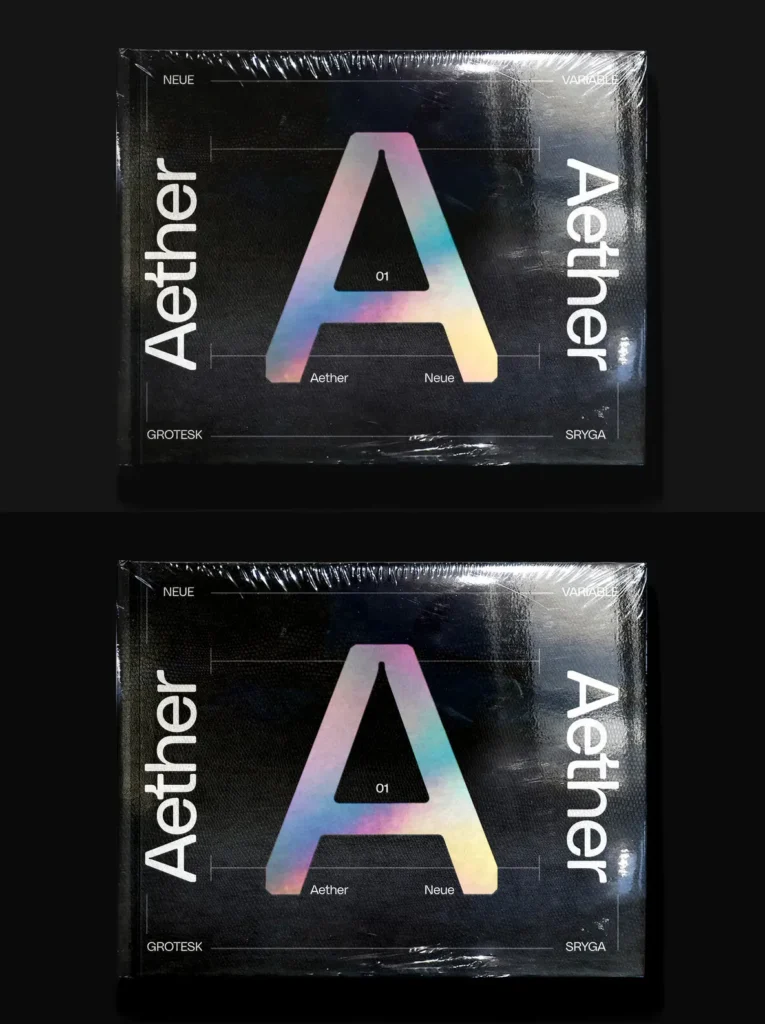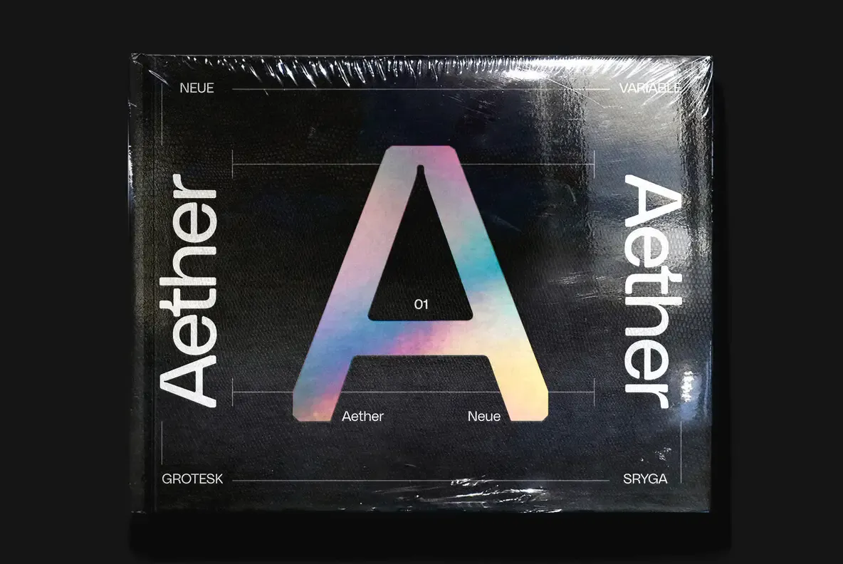
Aether Neue — Neo-Future, Sharpened
Aether Neue is a refined evolution of the original Aether. It pushes the digital neo-futuristic aesthetic further while improving versatility and legibility. The family keeps the squarish-round foundation that defines Aether, but it reads cleaner and holds up better across sizes and use cases.
The design process focused on precise control of form. Sharp chamfered edges meet fluid, rounded ink traps, and that contrast stays consistent from letter to letter. Diagonal structures—especially in A, X, and K—were re-engineered with tighter geometry, giving the typeface a stronger, more deliberate rhythm.
To support readability, inside corners were softened slightly. This improves balance and clarity, especially at smaller sizes where tight joins can break down. Aether Neue maintains a seamless fusion of rigidity and fluidity, blending futuristic constraints with a sense of dynamic flow.