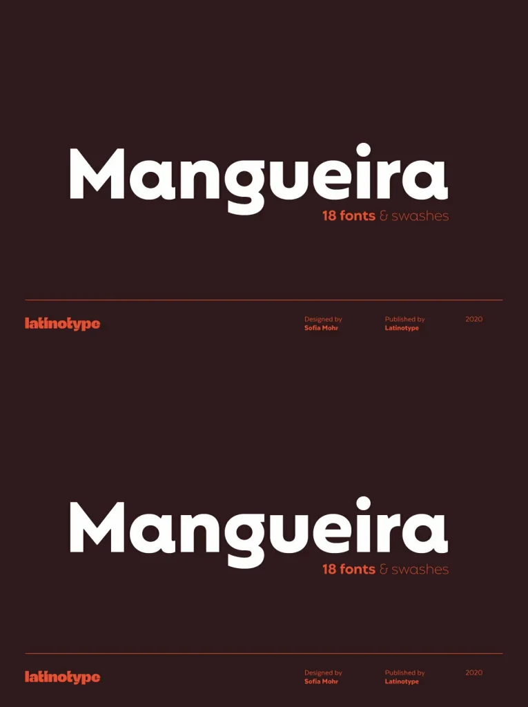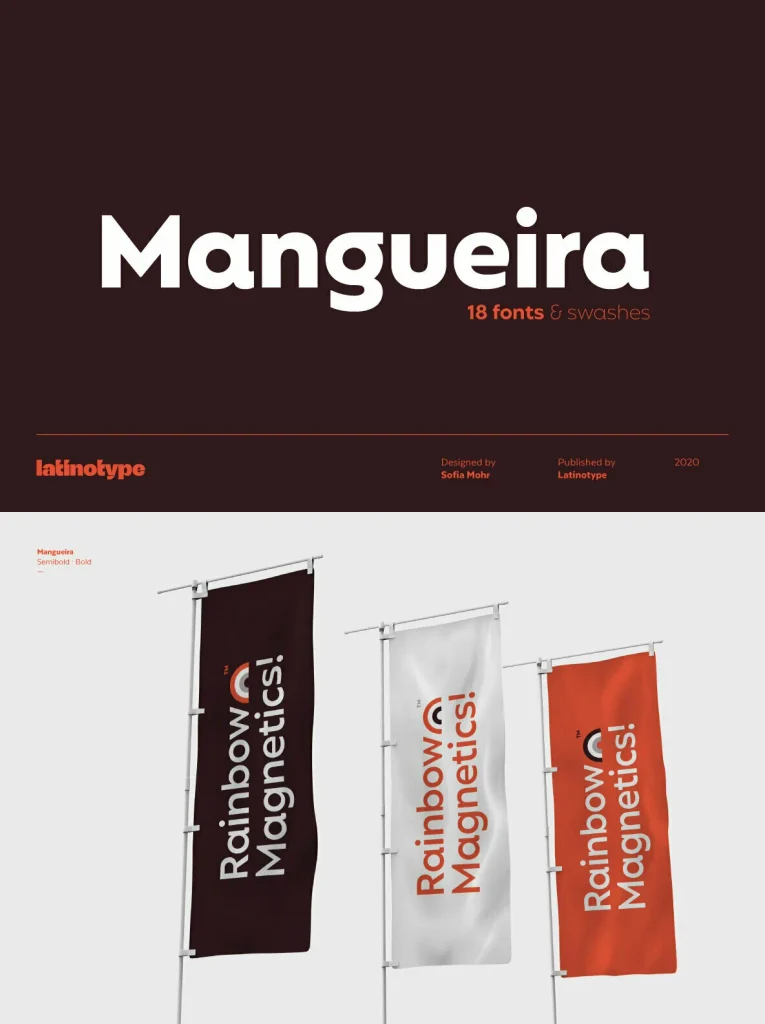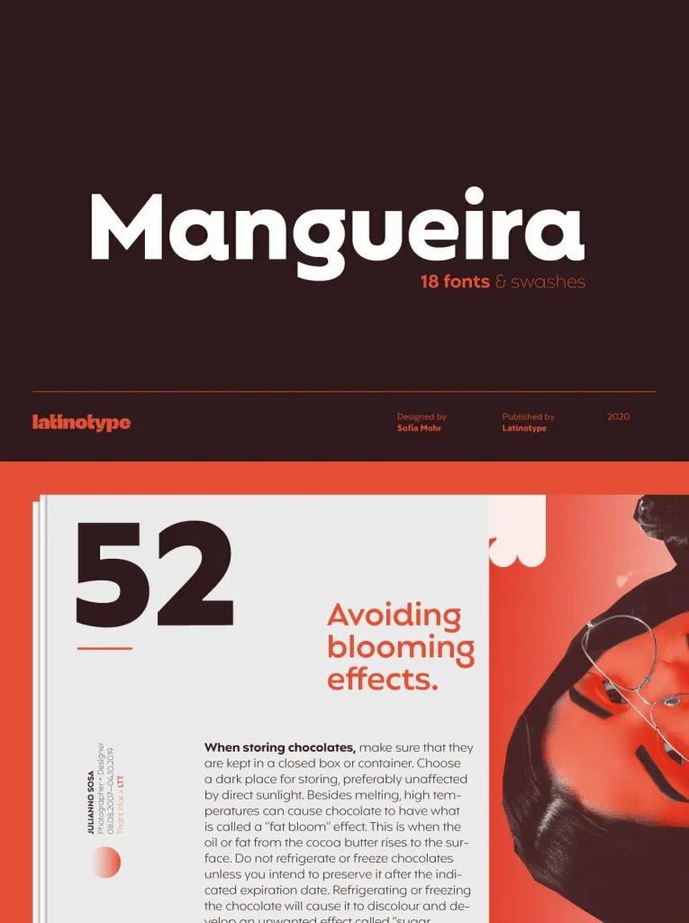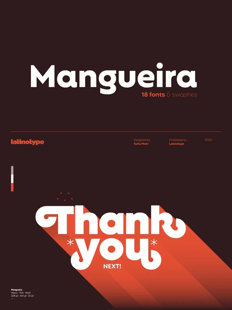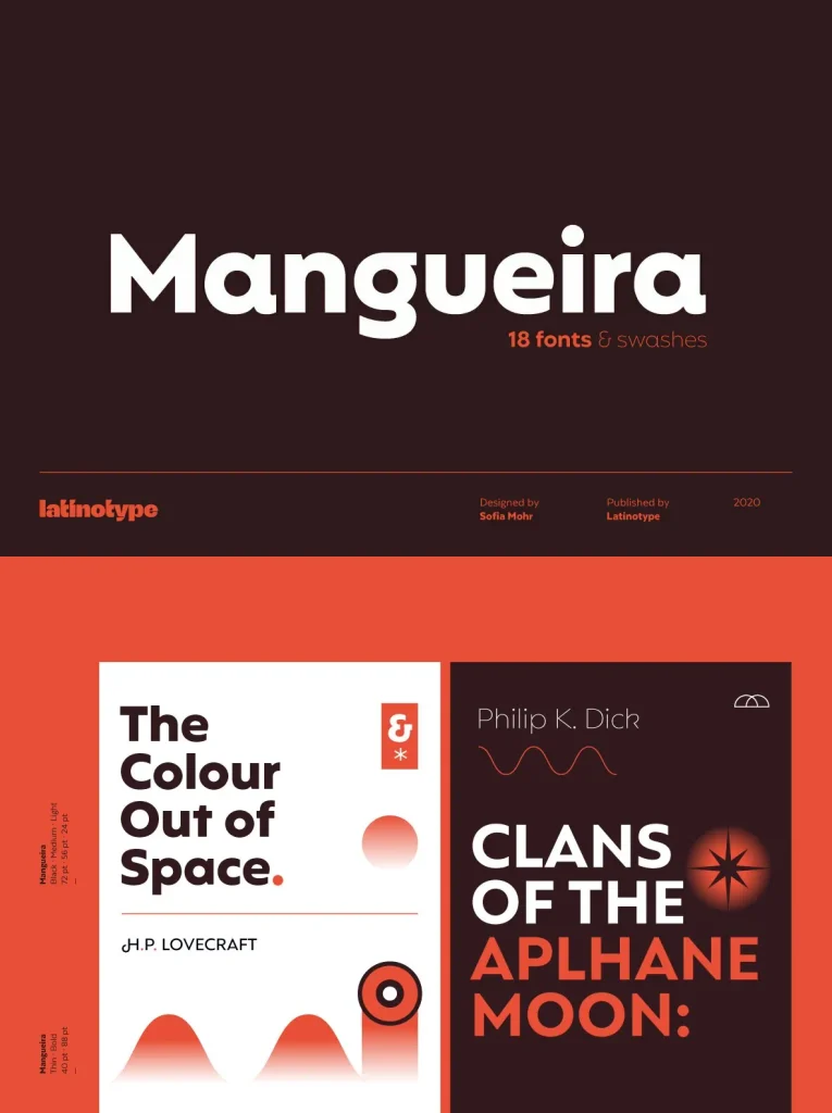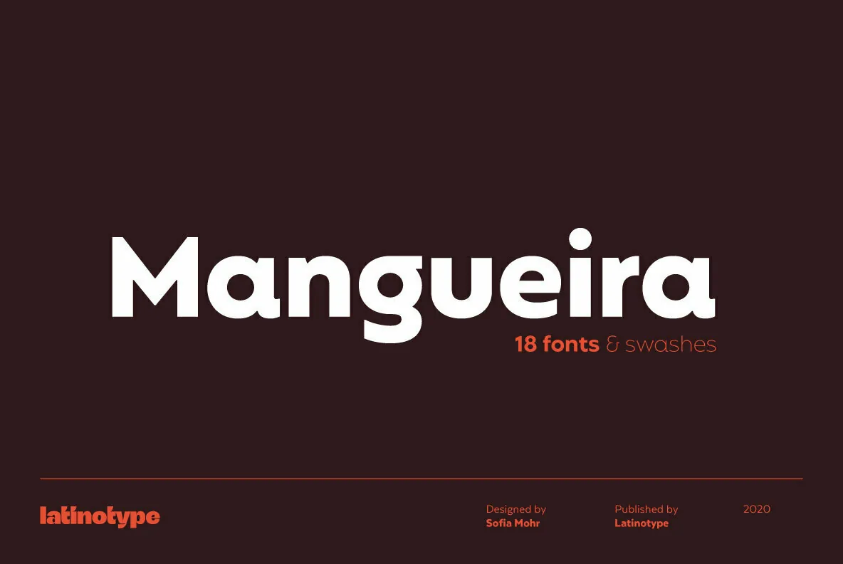
Mangueira Sans-Serif Geometric Typeface
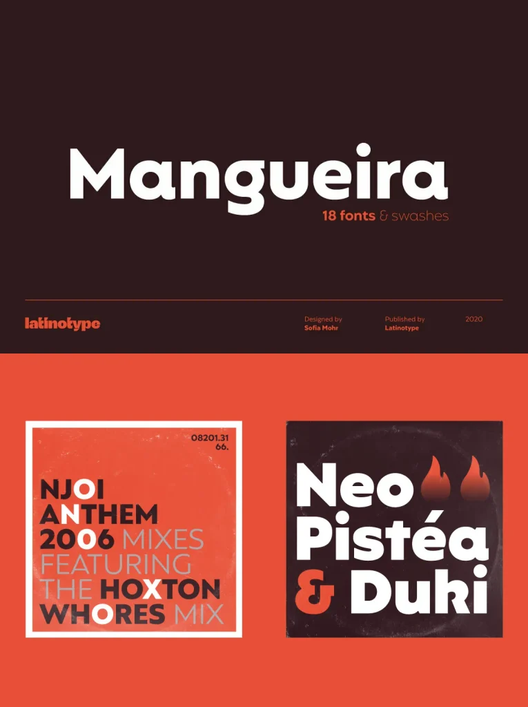
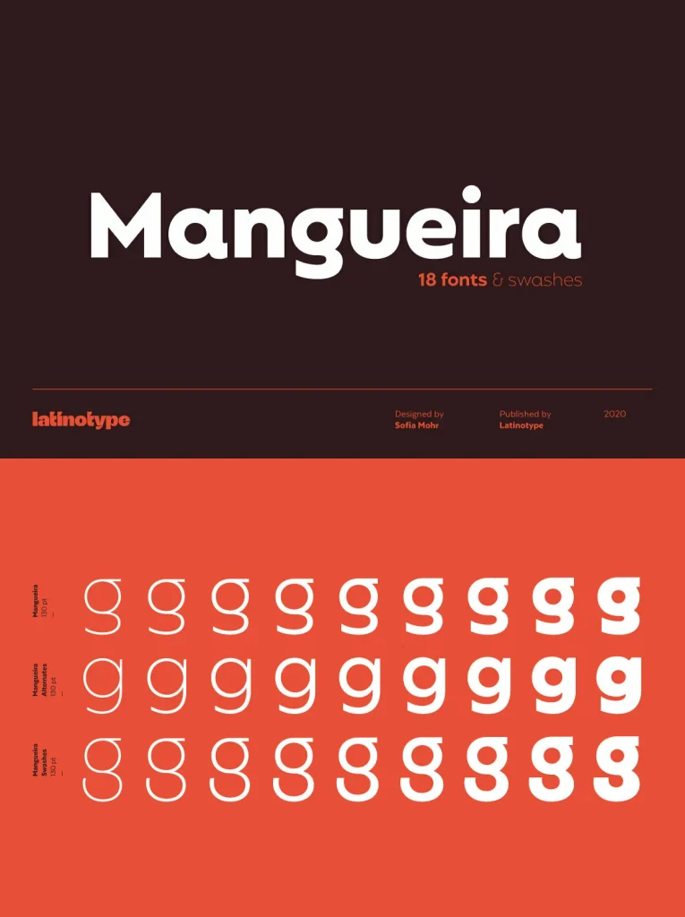
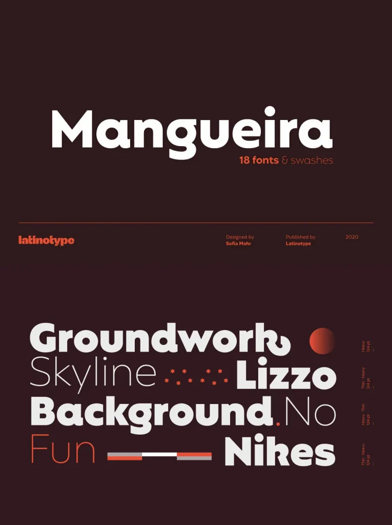
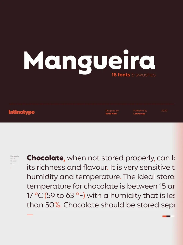
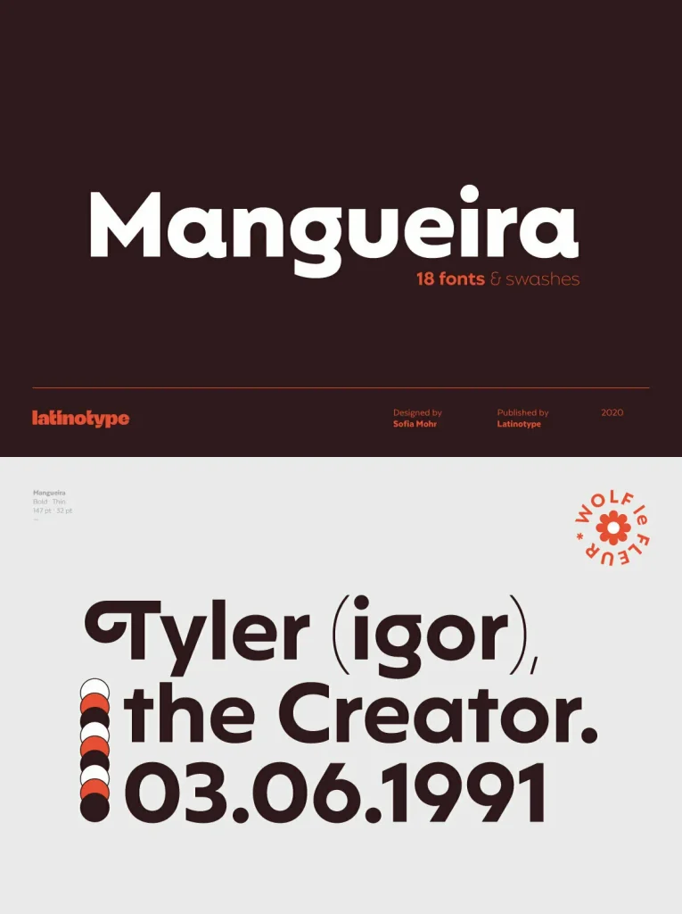
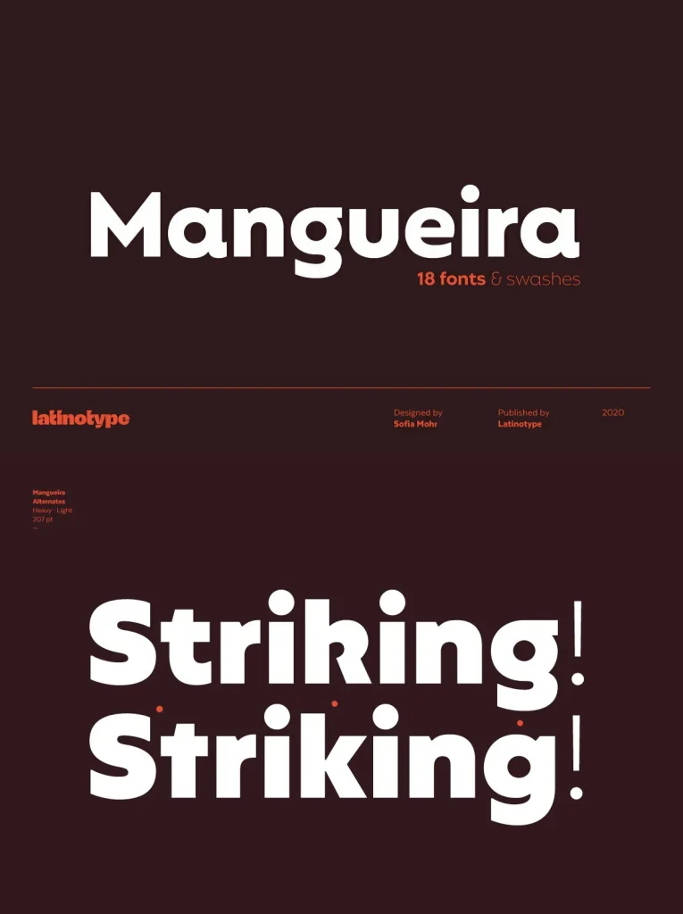
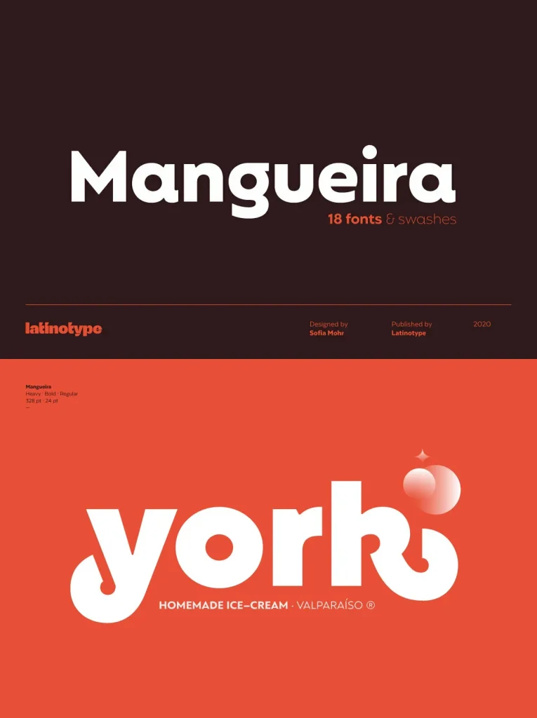
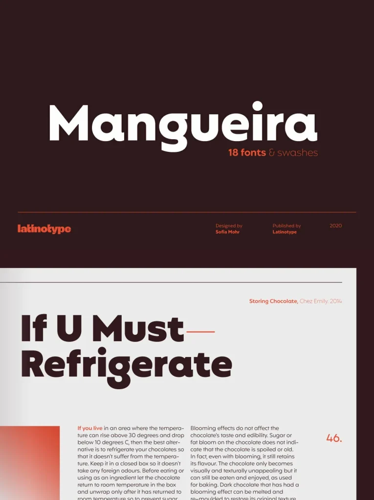
Mangueira offers a versatile geometric sans-serif design, presented in two distinct sub-families. The standard set features a contemporary character ideal for striking display use, while the alternative version delivers a subtler tone suitable for short text blocks and understated titles. This balance allows Mangueira to adapt seamlessly across editorial layouts, branding applications, and modern digital interfaces.
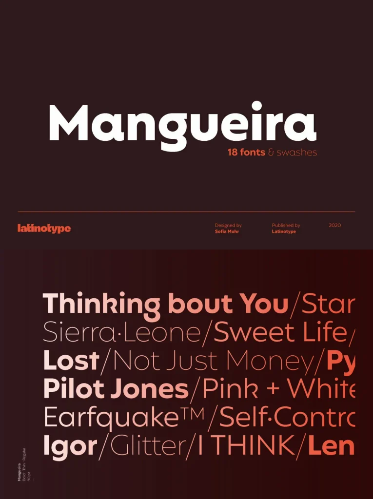
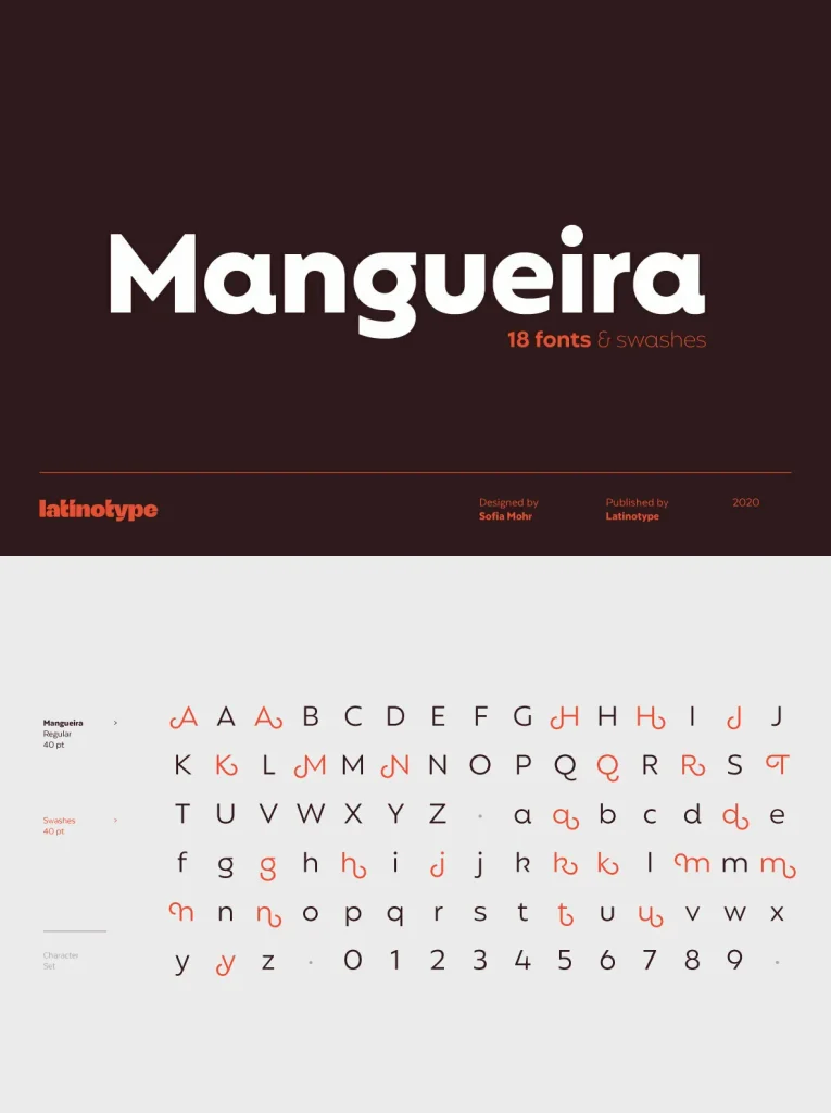
Each sub-family provides a comprehensive range of weights and glyphs. Meticulously designed letterforms ensure strong legibility in both print and on screen. Mangueira’s clean geometry and consistent rhythm contribute to a polished, modern aesthetic that suits a variety of visual identities.
Key Features
Two sub-families: standard for display, alternative for text
Geometric structure with refined details
Wide range of weights and glyph coverage
Optimized for both editorial and branding use