
Meriko by Juri Zaech: Geometric Sans with Authority
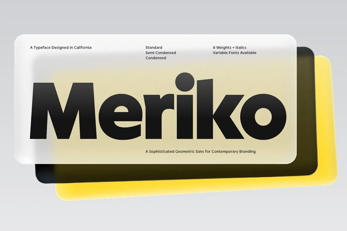
A sophisticated geometric sans built for branding and interface design, Meriko is a clean, dependable family available in nine weights and three widths. This genre carries much of today’s visual identity work, and Meriko earns its place with clear structure and a controlled voice that reads confidently across screens and print.
It positions itself as a distinctive alternative for modern branding projects in technology, culture, and commerce—from digital products to print environments and spatial applications. It suits both a fresh tech start-up and an established financial institution, with a universal presence that holds authority and enough character to support a memorable brand.
Its most prominent design feature is the angled terminal on stems, visible in letters such as a, d, n, and m. The accent feels subtly brutalist while staying refined within a geometric sans. In the italics, the angled terminal renders perfectly vertical. Vertically cut finials in letters like a, c, e, f, and s further distinguish the family and create a compact, clean texture, especially in heavier weights.
The full family includes three widths: Standard with circular forms; Semi Condensed for space efficiency; and a true Condensed that saves space while keeping clarity and character. Meriko also includes OpenType features and a family of 54 fonts, plus two variable fonts—one for uprights and one for italics.
OpenType Features
Stylistic alternates for Q, a, and y
Tabular lining figures
Slashed zero
Automatic fractions
Case-sensitive forms
Ligatures
