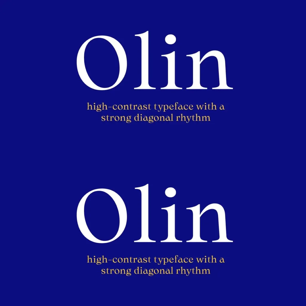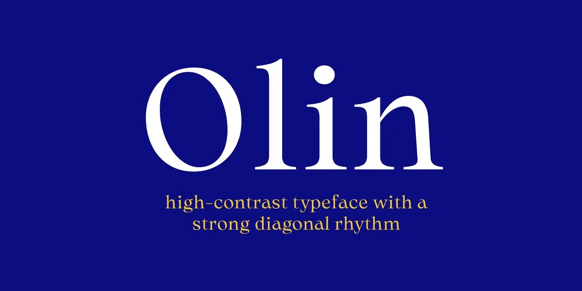
Olin — High Contrast, Diagonal Poise
Olin is a serif typeface defined by high contrast and a distinctive diagonal rhythm. It reads smooth yet precise on the page. The result feels elegant and warm at the same time, with a sophisticated tone that stays approachable.
Designed for editorial typography, Olin holds its own in magazine headlines and other display settings where detail matters. It also brings character to restaurant branding, bar identities, and creative projects that call for a refined sensibility. Each of the five available weights includes a matching italic, giving you reliable range for hierarchy, emphasis, and tonal shifts across a layout.
Features
Five weights, each with matching italic styles
Clear high-contrast letterforms for visual impact
Distinctive diagonal rhythm throughout the character set
Comprehensive Latin language support
Variable style capability to suit different design needs