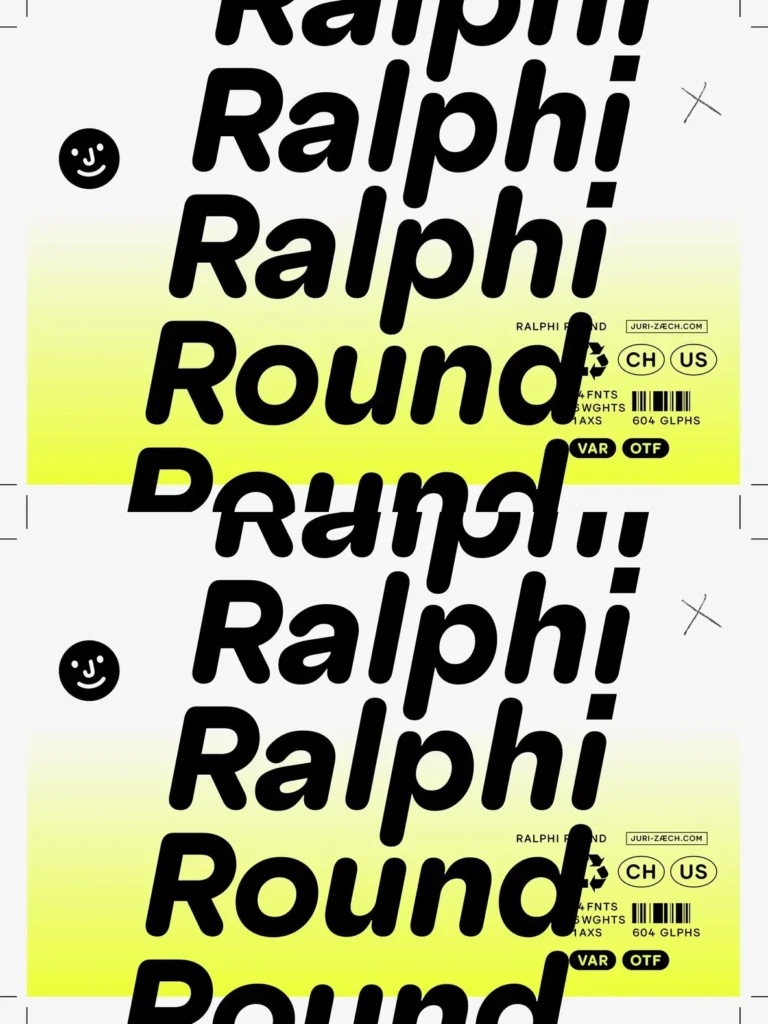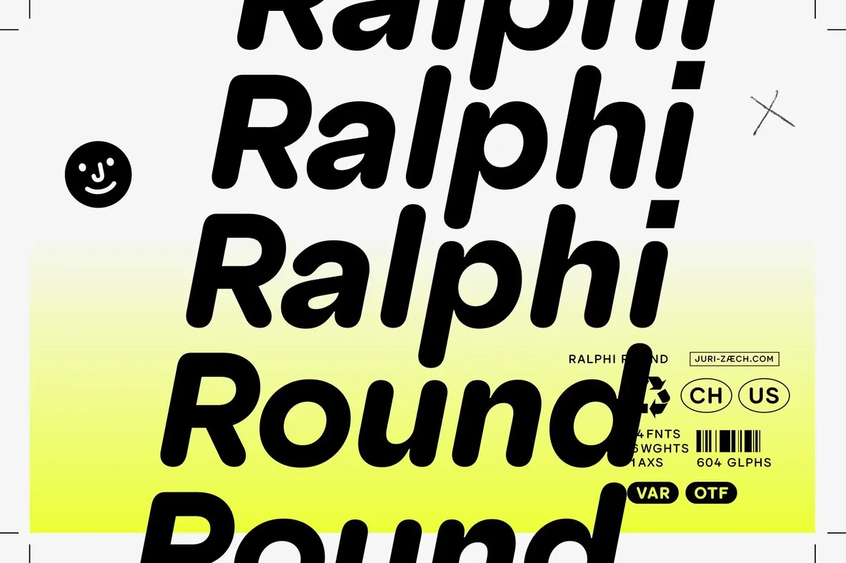
Ralphi Round — Friendly geometry, confident contrast
A rounded companion to Ralphi Sans, this typeface keeps the same geometry and warmth while adding a softer, more tactile tone. Rounded stroke endings support friendly branding and clear interface design. A deliberate visual inversion sets the personality apart and gives the family a distinct presence in contemporary typography.
Where Ralphi Sans paired round dots and punctuation with straight terminals, this design flips the logic. Rounded terminals meet sharply square tittles and punctuation marks. The contrast adds structure to the softness and keeps the overall voice confident and visually engaging.
Generous proportions, deep joints, and playful character details remain central. Letters such as a, f, q, t, y, and Q show lively gestures that read well in digital settings and identity work. OpenType alternates offer multiple forms for key letters like a, so you can tune the typographic voice from playful to clean. Designed by Juri Zaech, the family includes six weights with matching italics, plus 12 individual styles. It also ships as two variable fonts: one upright and one italic. The character set covers Underwear’s Latin Plus, supporting over 200 Latin languages, with careful kerning and features including tabular figures, case-sensitive punctuation, automatic fractions, circled numerals, and arrows.