Utily Sans: A Modern Take on Humanist Typography
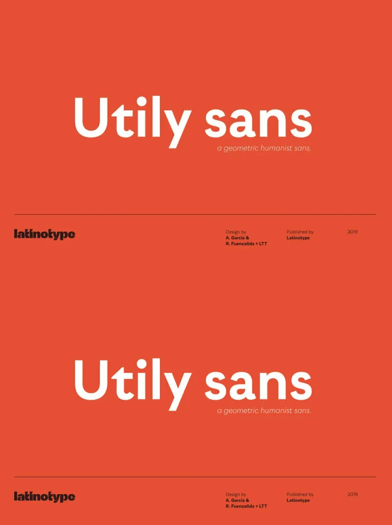
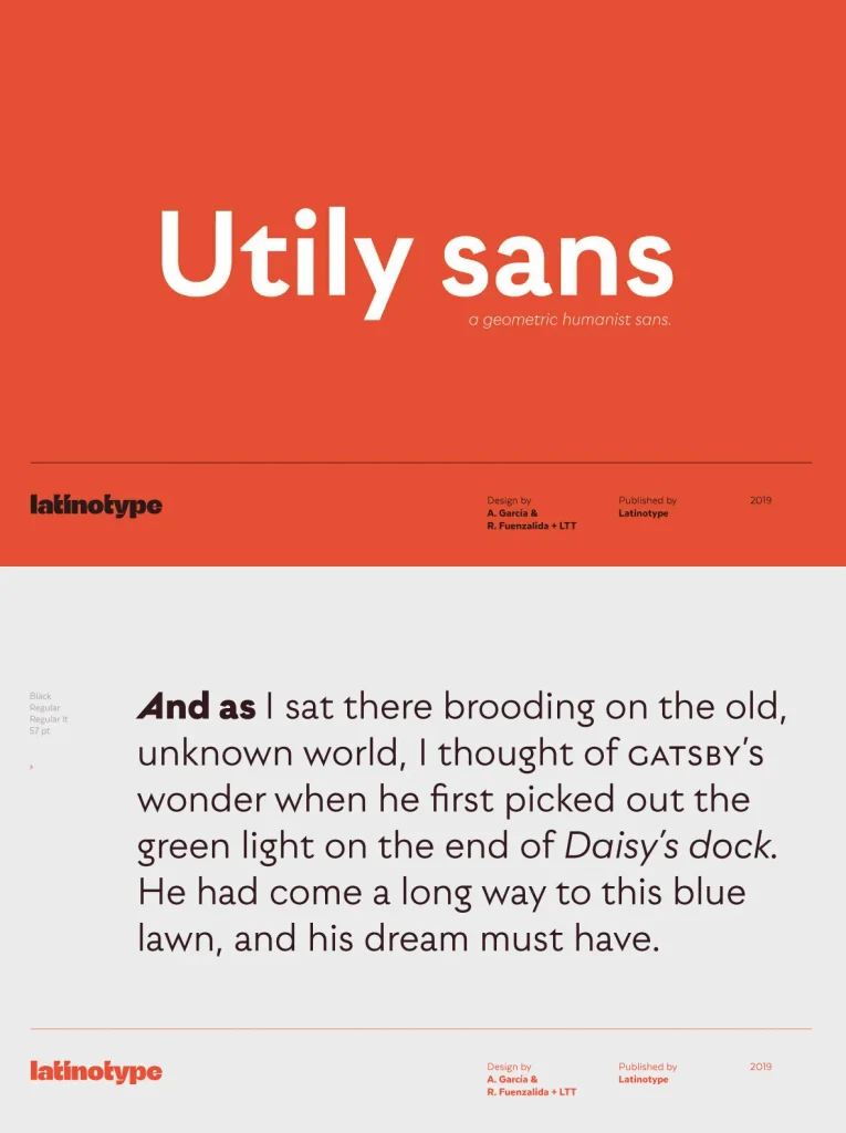
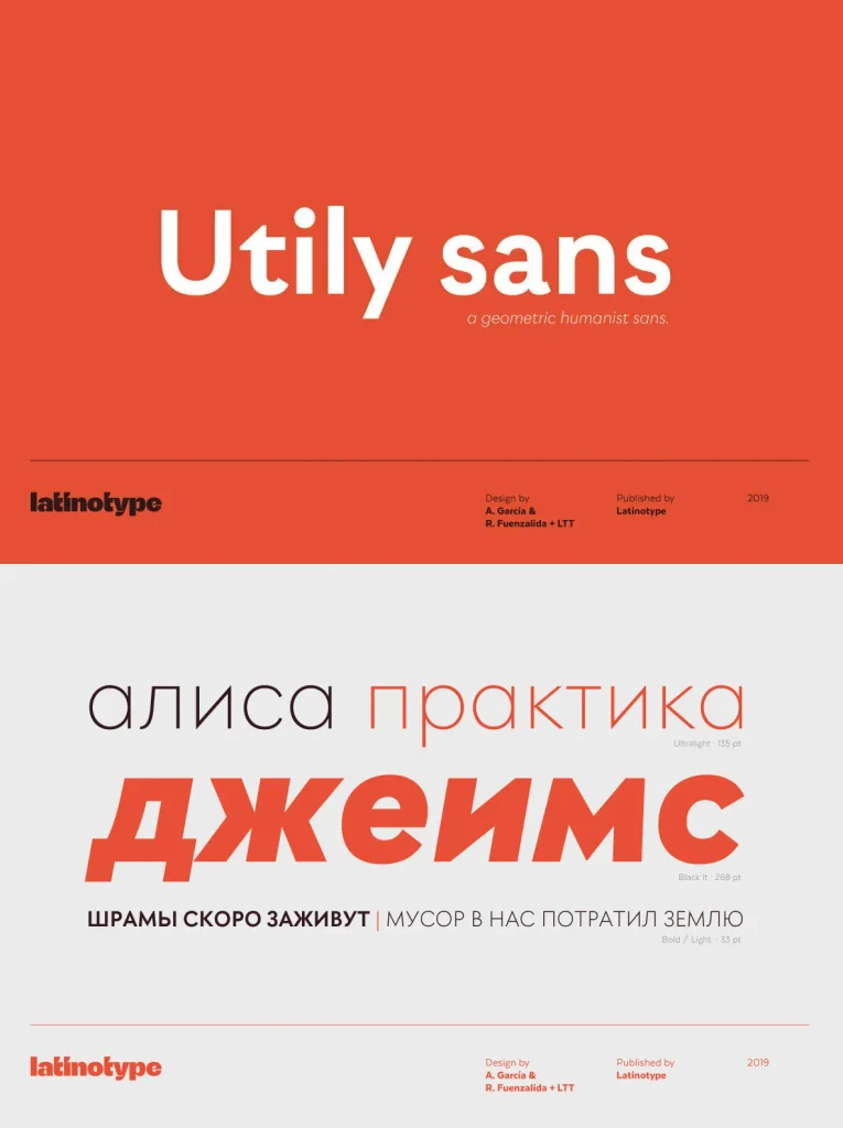
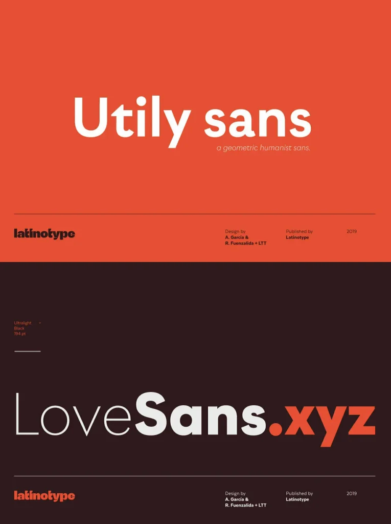
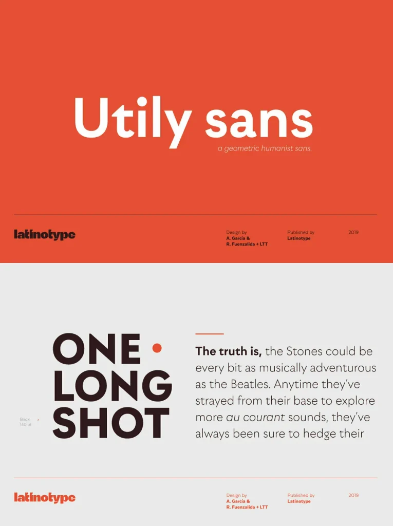
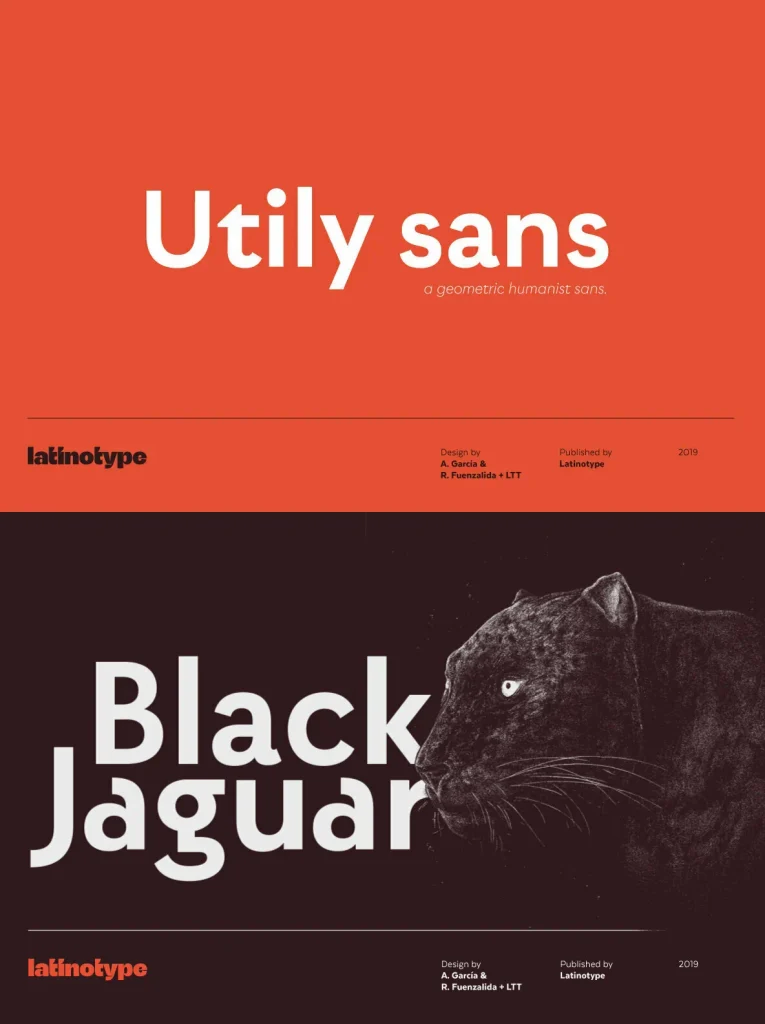
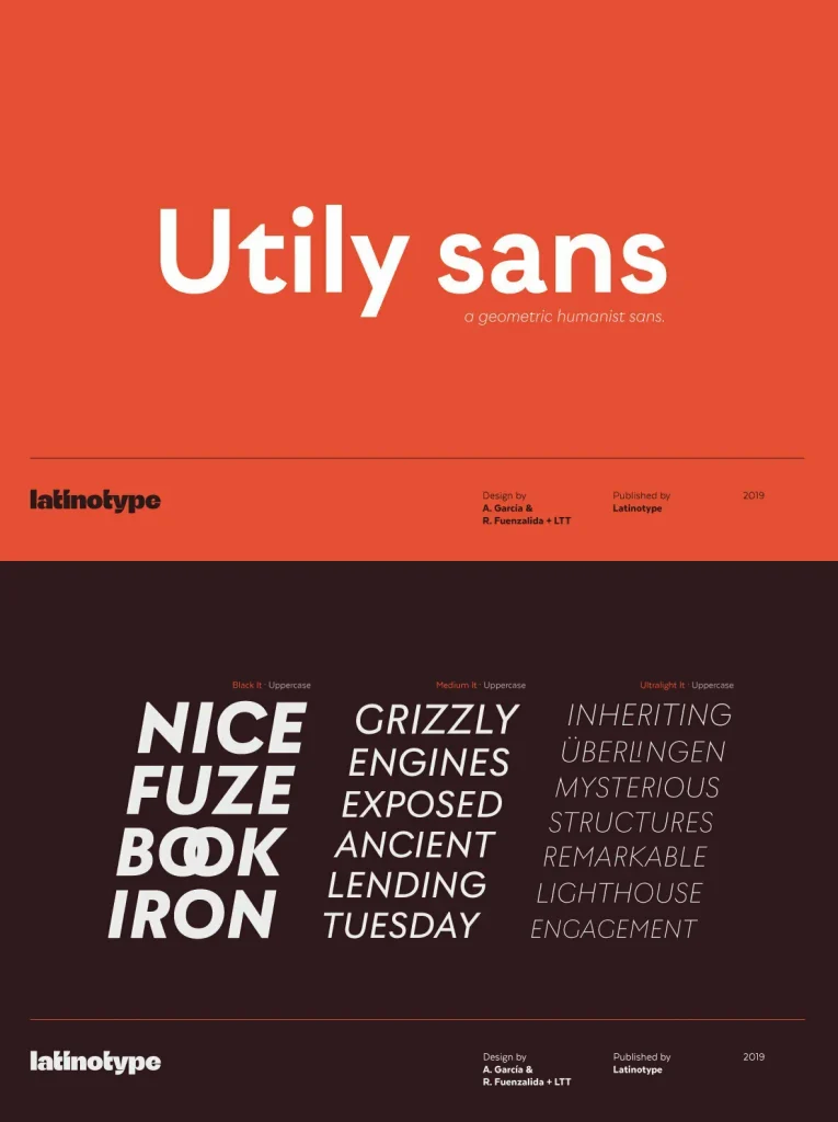
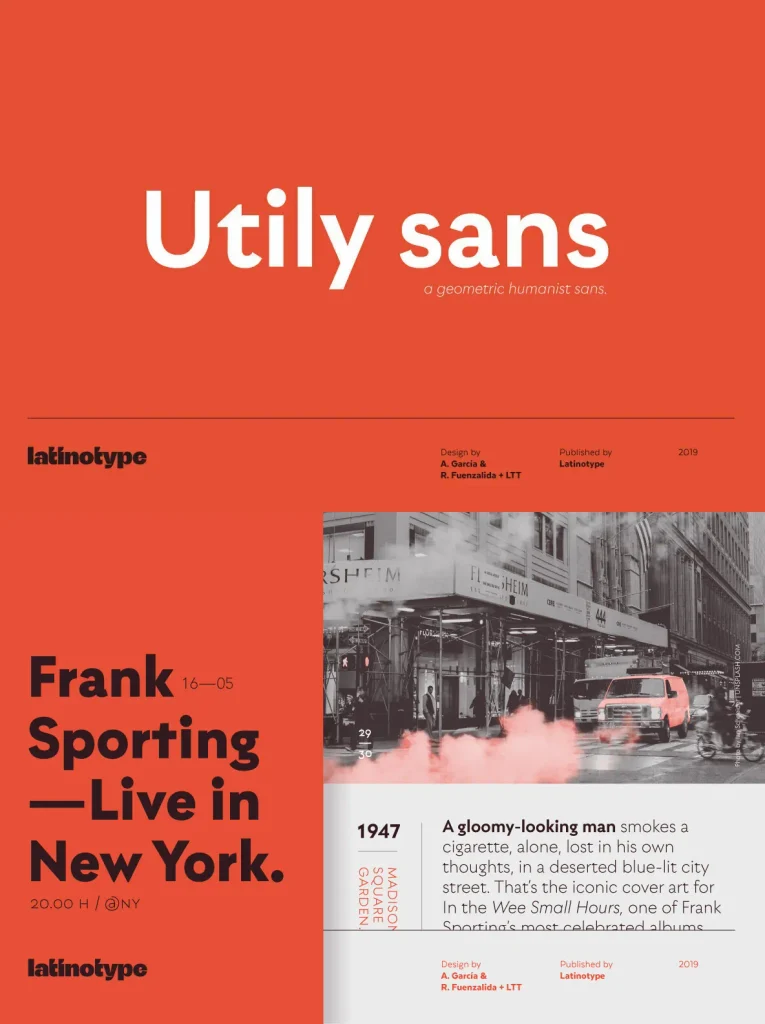
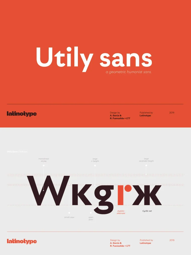
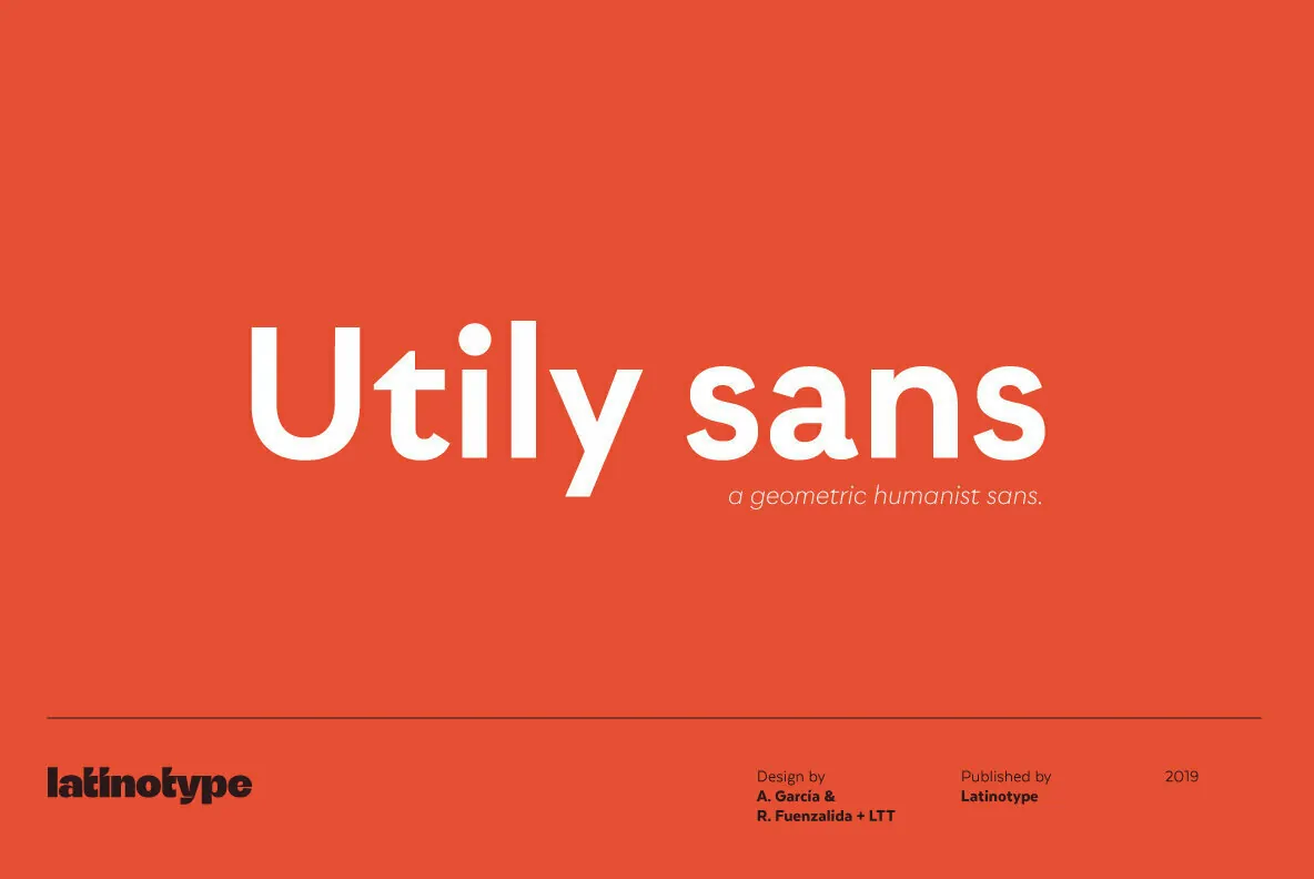
Utily Sans explores the intersection of humanist style and classic geometric principles, offering a fresh vision inspired by the work of Paul Renner. This typeface stands out with proportions and details that suit extended reading, making it a strong choice for designers seeking readability and character in their long-form text projects.
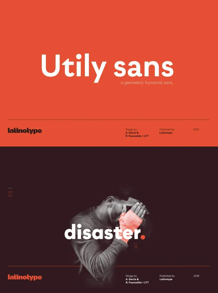
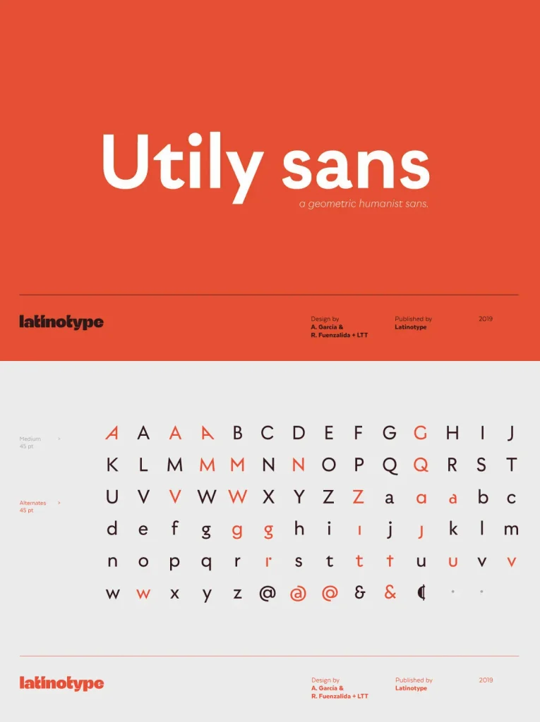
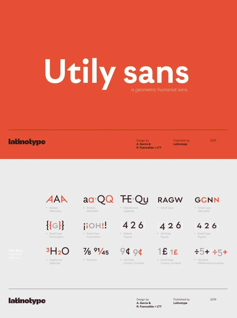
The design features subtle curves, generous spacing, and refined glyph shapes that maintain clarity across sizes. Utily Sans ensures body text remains approachable and visually engaging while retaining a contemporary edge. Its careful construction supports layouts for books, editorials, and digital content without sacrificing personality or function.
Key Features
Humanist-inspired proportions for comfortable reading
Balanced shapes with modern geometric influences
Clear distinction between characters for improved legibility
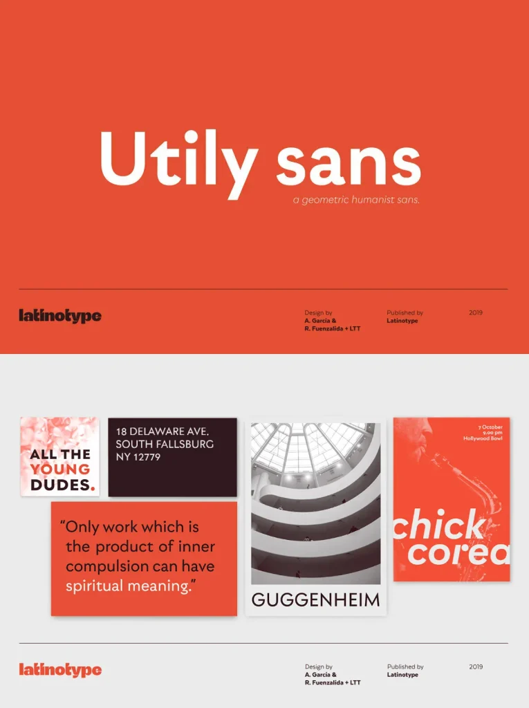
Versatile design suitable for print and digital use