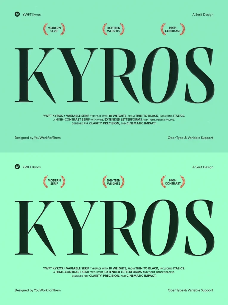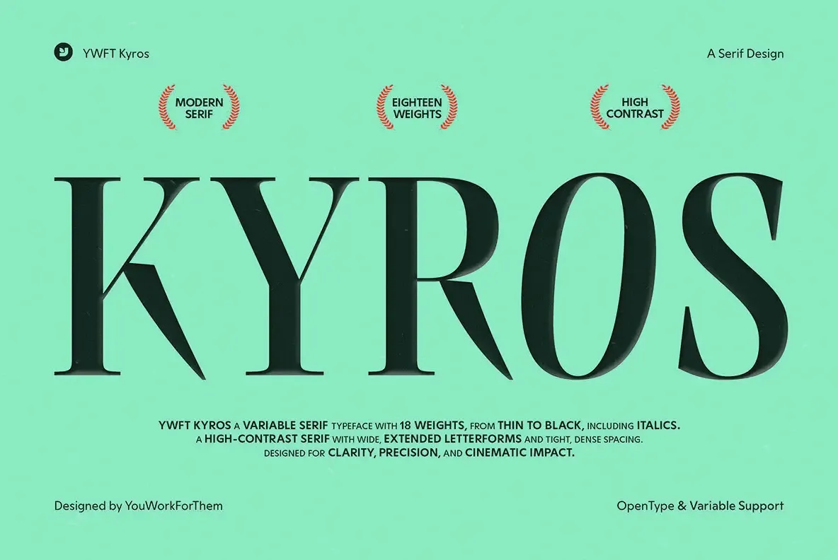
YWFT Kyros: A Modern Serif with Asian-Cinematic Class
A high-contrast transitional serif built for the big stage. YWFT Kyros carries elongated verticals, razor-fine hairlines, and generously bracketed joins that read as poised rather than precious. Think editorial splash pages, fashion mastheads, film posters, and luxury branding where a single word has to do the heavy lifting.
Font Features:
18 weights from Thin to Black, with matching italics
Variable font support for continuous control over weight and slant
Tight default spacing for dramatic headlines; tracks cleanly from -10 to +10 without falling apart
Robust ligature set and refined punctuation for credit blocks and bylines
OpenType essentials for contemporary workflows
Why it works at display sizes
Kyros is cut with tall x-height and narrow proportions, so lines stack elegantly without chewing up space. The stroke modulation pushes contrast to the edge but keeps terminals and joins bracketed enough to avoid the brittle look of pure Didone. Counters stay open; vertical stress keeps words upright and calm even at extreme sizes.
Use cases that sing:
Magazine covers and feature openers
Fashion and beauty identities
High-end packaging and catalogs
Festival posters and title cards
Opening movie title typesettings
How it feels
Sophisticated, not fussy.
Hairlines are crisp; bracketed serifs round the edges.
Dramatic, not loud.
Long ascenders/descenders add rhythm; narrow caps keep titles compact.
Clean word shapes.
Modulation doesn’t get in the way of texture, so multi-word headlines remain readable.
Close typographic relatives (and why)
If you’re hunting by eye, Kyros sits in conversation with:
Bodoni
— shares the theatrical contrast and disciplined verticals, but Kyros keeps bracketed joins for a softer attack.
Didot
— the same couture polish at headline sizes; Kyros is slightly warmer in curves and less brittle in hairlines.
These comparisons are about behavior: contrast, stress, serif logic, and spacing—useful when pairing or substituting in brand systems.
Practical notes for better results
Sizes:
Designed for display. Start at 24–36 pt and scale up; the hairlines reward large formats.
Line height:
Tight for titles (1.0–1.1). Give body pull-quotes more breathing room.
Pairing:
Set Kyros with a neutral grotesque or modern sans for UI and decks.
Variable axis:
Nudge weight live to balance thin hairlines against challenging substrates and lighting. If you need full variable control across a system, explore the
Variable
category for more companions.
If your brief calls for a serif that reads couture in a headline and composed in a logotype, YWFT Kyros earns its spot. It brings poise, clarity, and just enough edge to make the room go quiet before the first line even lands.
Additional products used for slideshow images:
Stage Screen Mockup